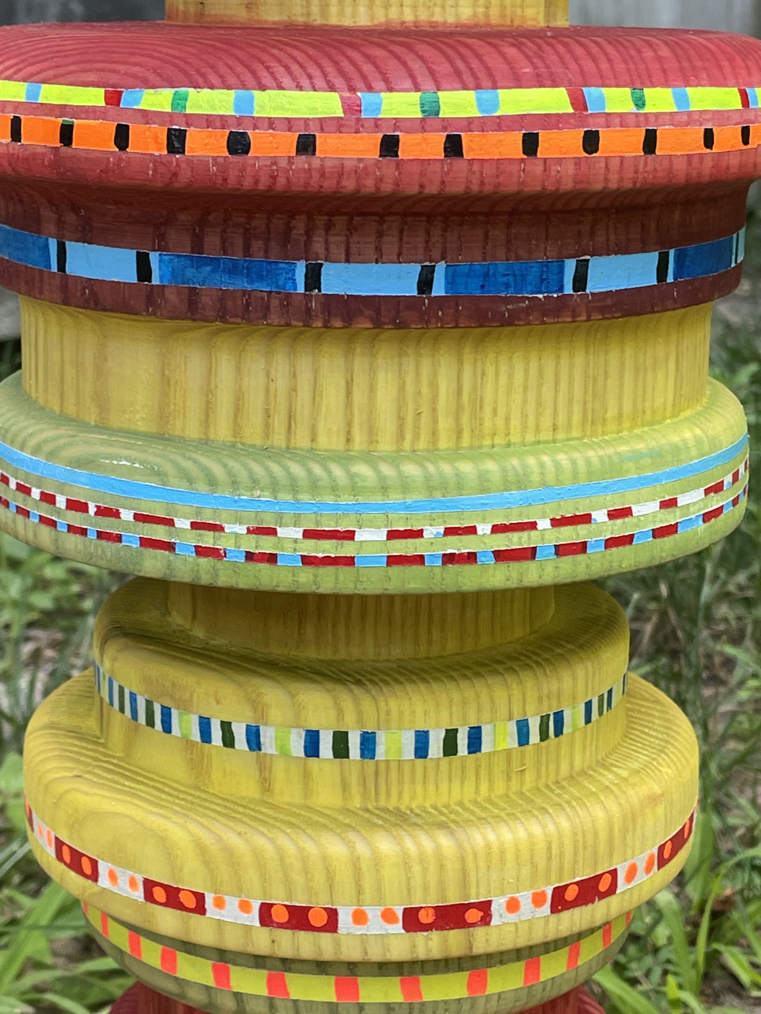


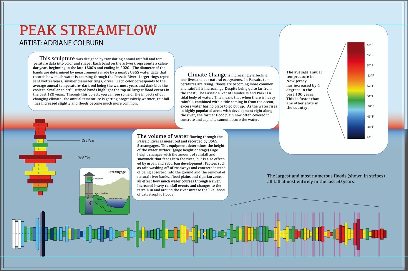
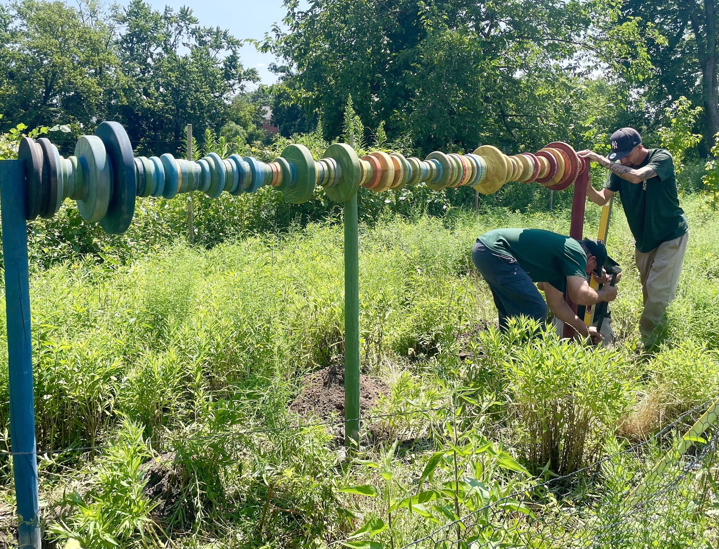
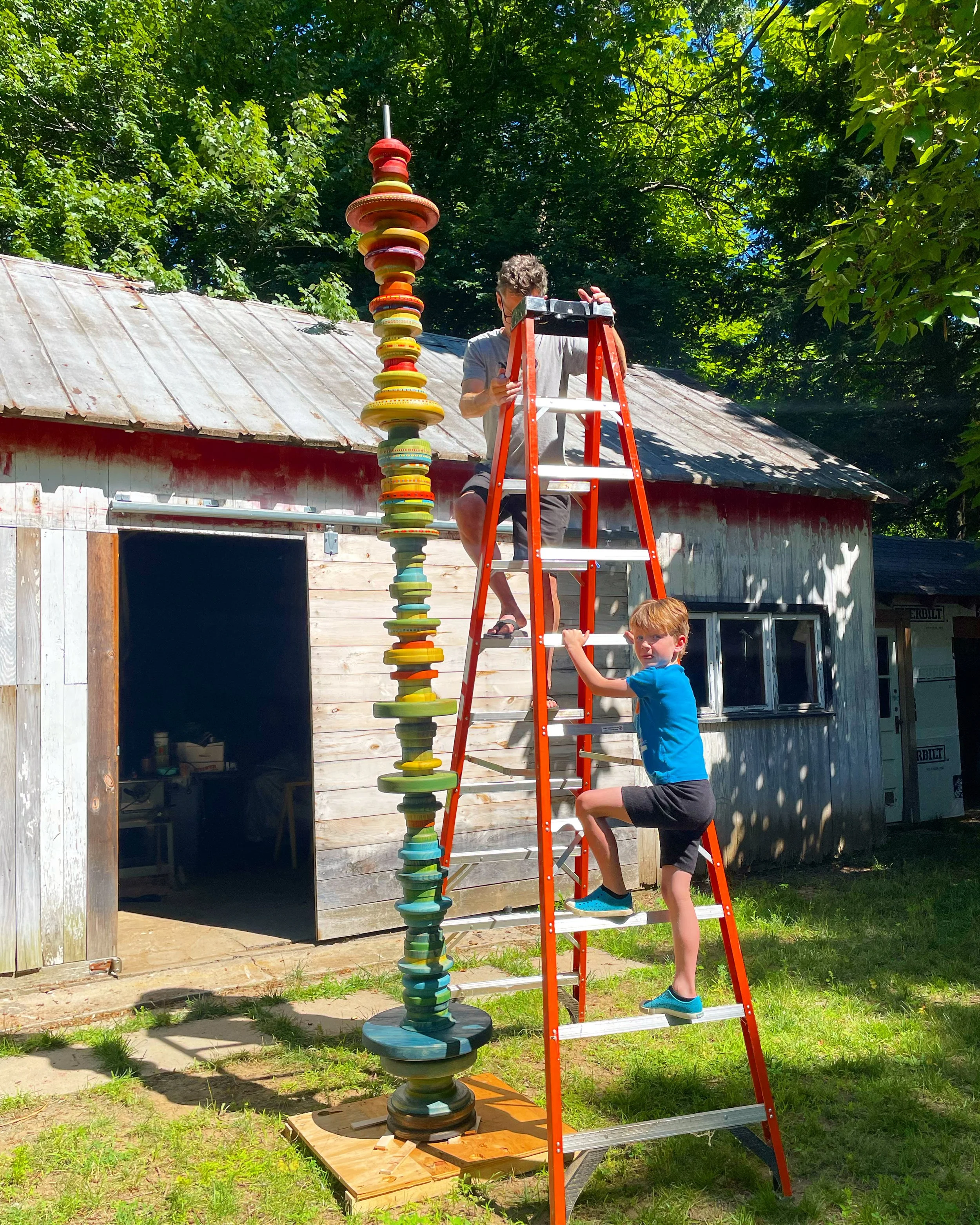

This sculpture was designed by translating annual rainfall and temperature data into color and shape. Each band on the artwork represents a calendar year, beginning in the late 1800’s and ending in 2020. The diameter of the bands are determined by measurements made by a nearby USGS water gage that records how much water is coursing through the Passaic River. Larger rings represent wetter years, smaller diameter rings, dryer. Each color corresponds to the average annual temperature- dark red being the warmest years and dark blue the coolest. Smaller colorful striped bands highlight the top 40 largest flood events in the past 120 years. Through this object, you can see some of the impacts of our changing climate- the annual temerature is getting progressively warmer, rainfall has increased slightly and floods become much more common.

2022
Lathe turned wood and paint
Commissioned by NOAA and the NJ Department of Environmental Protection